Inteleos Interaction Field
Delivering interaction field platforms to help patients in resource-constrained economies to have access to the best standards of image-taking
Industry
Health
Client
Inteleos
Service
UX
Date
Inteleos, a non-profit that certifies sonographers around the world, has brought together with Vivaldi's, an ecosystem strategy that brings together the key actors around image-taking in order to establish worldwide objective quality standards and to ensure a combination of crowd-sourcing and AI, so that every patient around the world has access to the best minds, the highest standards in taking pictures, and ultimately, the best image interpretations and outcomes.


PROBLEM
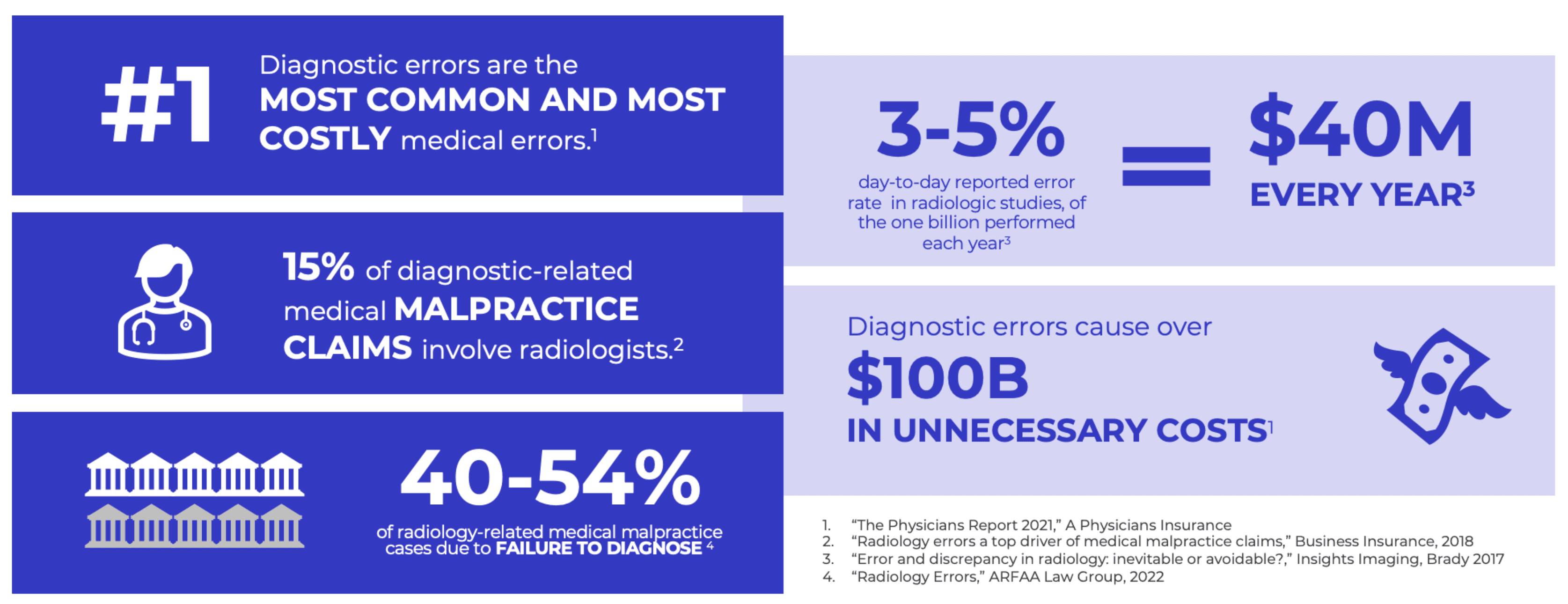
Right now, patients in access-constrained economies do not have the same access to the highest standards of image-taking. As a result, 40 million errors occur on a yearly basis, leading to misdiagnosis, mistreatment, fatalities, and higher costs due to retakes. This type of problem is systematic and cannot be solved by any one actor alone.

Access to high-quality image-taking is limited in many economies, leading to 40 million errors annually and significant healthcare challenges
SOLUTION
Healthcare 4.0 emphasizes data-driven collaboration to address such issues. Our project focused on designing core interactions for expert reviewers and image submitters. Results show high user satisfaction, with beta testing underway in Latin American hospitals. Challenges included platform development, future AI integration, and adapting UX/UI processes. Despite obstacles like limited access to professionals and fluctuating team sizes, progress continues.

DESIGNING AN INTERACTION FIELD
According to Erich Joachimsthaler, Vivaldi's CEO, an Interaction Field purposes are maximize interactions across a broad network of participants that create value for everyone and create value through interaction velocity (that powers the network effects, learning effects, and viral effects).
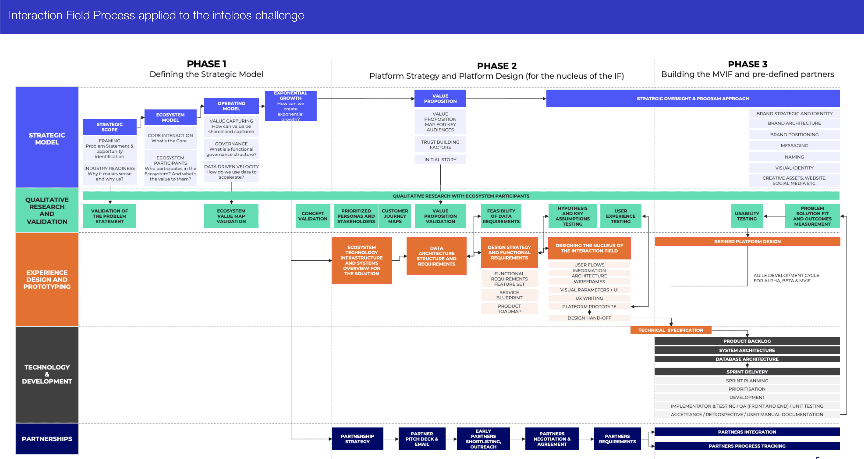
In order to deliver an interaction field for inteleos, a process was created from scratch, based on the book The Interaction Field: The Revolutionary New Way to Create Shared Value for Businesses, Customers, and Society.

Interaction Field Process

Core interaction between users
PROCESS
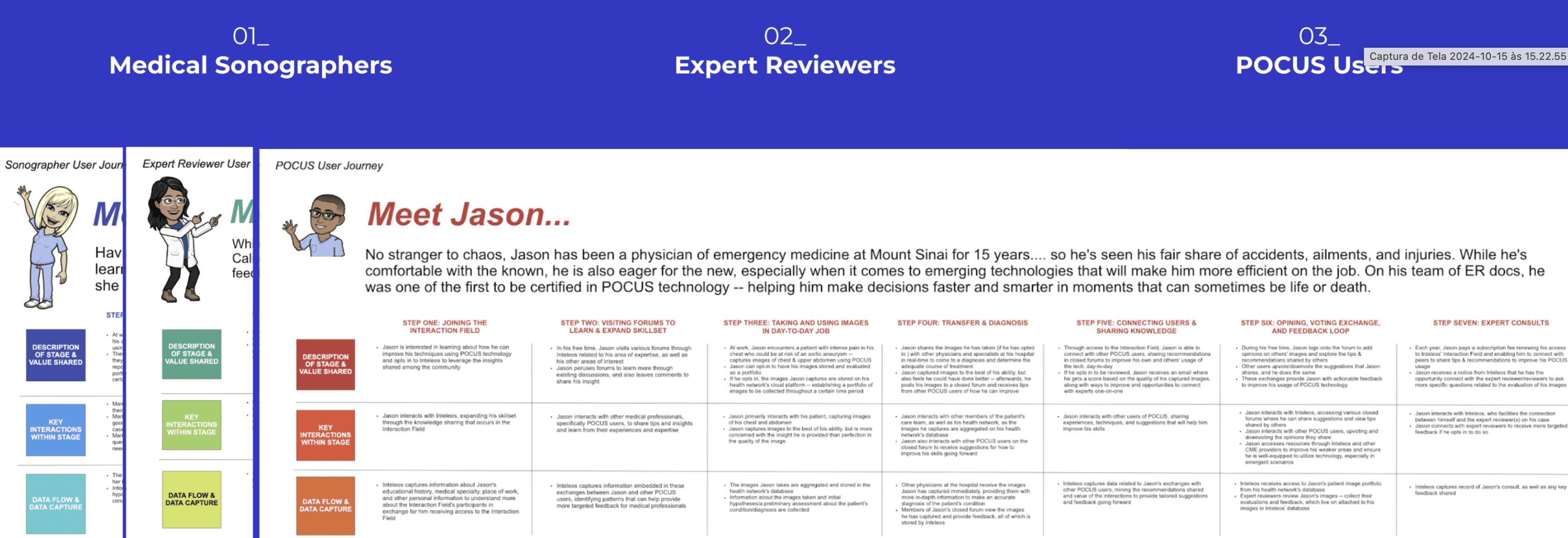
Personas and User Journeys
We started mapping all participants, their contribution and the potential benefits from the platform to early identification of opportunities and risks.

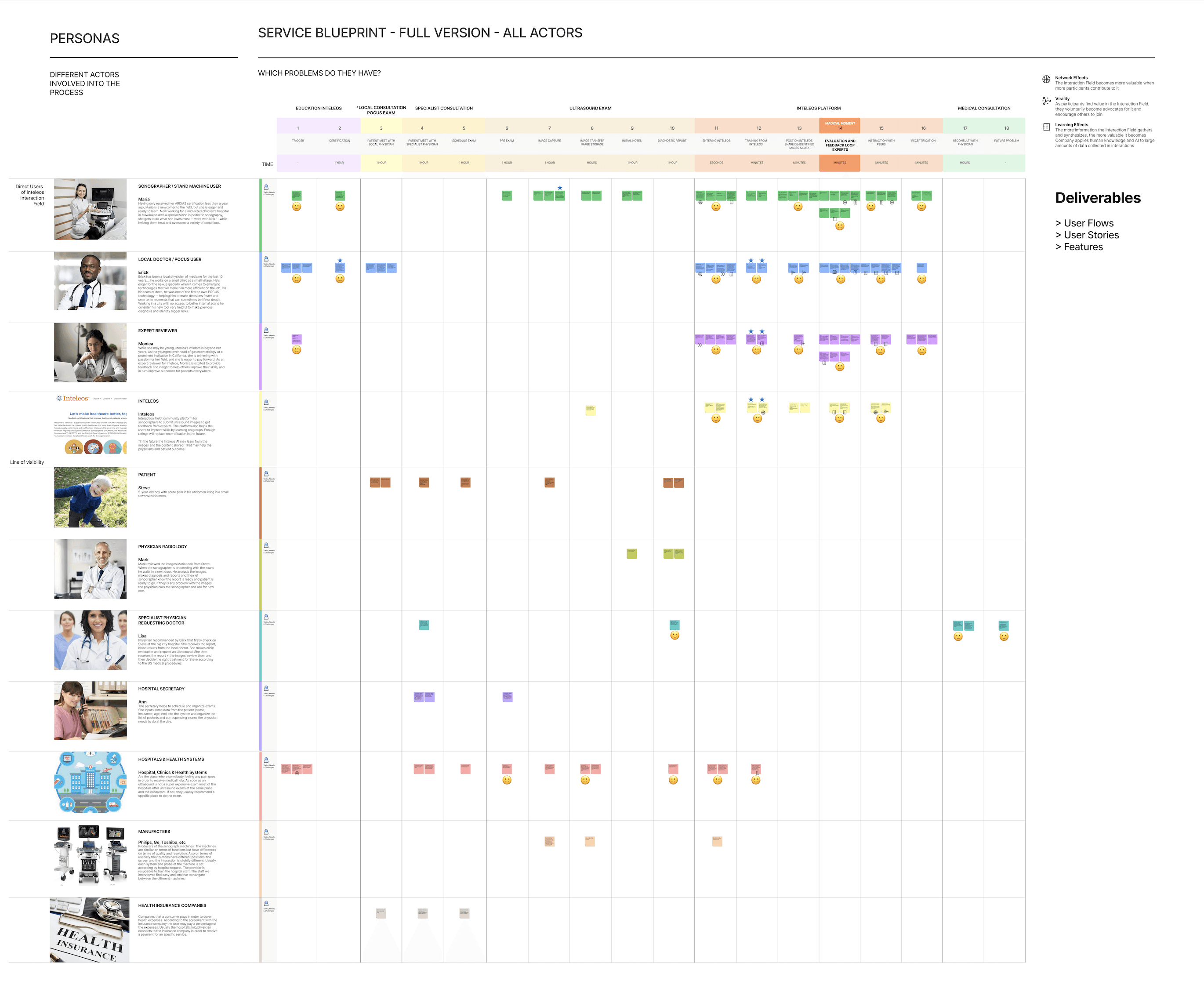
Service Blueprint
Then we mapped the AS IS + TO BE prioritized Stakeholders and Users journey, interaction and experience map, including front and back platform development notes for interaction value understanding and implication for back-end systems.
We mapped the key features, the data flows, the user stories to enable front-end and the key integrations with 3rd party tools.

Infrastructure, System and Data
Understanding the technological landscape around the problem was important to identify opportunities to better assess where the opportunity lies, the potential barriers and potentially what should be built, bought and/or partner with.
We mapped the existing data sources, the data flow between them, and the technical requirements to access and transfer the data, anticipating risks and planning technical requirements.

Information Architecture
We mapped, grouped and prioritized the information to address the platform structure in a logic and easy way for the user to find what is needed.

User Flow
We designed the different user flows for a better communication between teams, also to serve as a reference for wireframe and prototype design. It helps to mind the information we’d like to present to users and pre plan how they should complete the desired tasks efficient as possible.

Mid-Fidelity Wireframes
We used the architecture as reference for a static skeleton of the UX with the core functionalities to provide an early understanding of the platform to get stakeholder and project team approval.

Prototyping & Testing the Model
Clickable prototypes were developed in figma, based on the aligned roadmap, the user journey, and service blueprint. Service and experience validation was necessary to ensure problem-solution fit, as well as to qualitatively test interaction options with participants. We’ve ran more that 60 validation interviewers, across the world, and healthcare professionals all said that the concept provided value in multiple areas.

Alpha, Beta and MVP building
The different launching stages were planned and designed in an agile development cycle. As we moved and learned we fine-tuned the user experience and the process itself, driving client buy-in, user adoption, retention and satisfaction.

Features
Image selection and upload, reviewing feedback along time and comparative to other users and detailed scores. AI recommendation of discussions happening at groups to improve weak skills. Expert 1:1 discussion schedule feature.
Case review flow, scoring system, back and forth messages, accepting and having 1:1 video discussions.

Design System

Growth: driving engagement and retention
As the interactions took place, it was key to develop an incentive structure to inspire participants to continue making valuable contributions (user engagement and retention) by incorporating game elements and mechanics.

RESULTS & IMPACT
Deliver interconnected platforms with pre-planned features, integrate data analytics and AI, accommodate multiple users and stakeholders, adapt UX/UI to interaction needs, align digital agile processes with Vivaldi's strategic framework, address restricted access to professionals, and overcome team challenges.
The beta version is currently implemented for testing in several hospitals in Latin America, where there is a great appetite to provide patients, especially in isolated rural zones.
100% of interviewed users said the concept provided value in multiple areas
“I think it’s a way to get things in the real world faster. It’s a really cool way to share learning and possibly gain credence for what you’re doing.”


