Generating consistency through the redesign of Claro Emails
Generating consistency through the redesign of Claro Emails
Industry
TELCO
Client
Claro
Service
UX/UI
Date
2020

Claro identified that emails sent by the different internal areas were following different flows, references and guides. This implied in visual and content inconsistency.
Redesigning the emails impacted the brand and message transmission. At the same time improved the team efficiency by providing a clear direction with the same reusable elements for all the company.
PROCESS
We understood the operating model of the different teams:

1. We mapped all the emails in Excel for quick ordering and pattern identification
We mapped the emails generated by the different areas and organize them according to their channels, needs and objectives. We found 2 large categories:
Primarily communication (yellow): communication purpose, between Claro and user.
Primarily marketing (red): inform goal, stimulate conversion and brand impact, mostly campaigns.

2. We used atomic design, the templates were built using components as “lego” blocks
We designed the new email flow, specifying the responsibilities of the areas involved, the differences between the processes used by each one and also devising an ideal flow to guarantee the continued consistency of the emails.
We generate an ideal flow recommendation so that marketing, the area that owns the Claro brand, is always the intermediate checkpoint between requests and final deliveries.

3. We generate autonomy in the execution of emails
We generate different architectures for different types of emails with the concern of maintaining consistency as well as flexibility for different user areas. We also facilitated the connection with the Design OPs area of Claro Brasil for Design System benchmarking
All emails should use same style for headers and footers
All emails start and finish with greeting
Title and subtitle are highlighted and objective
Functional messages are clear and objective
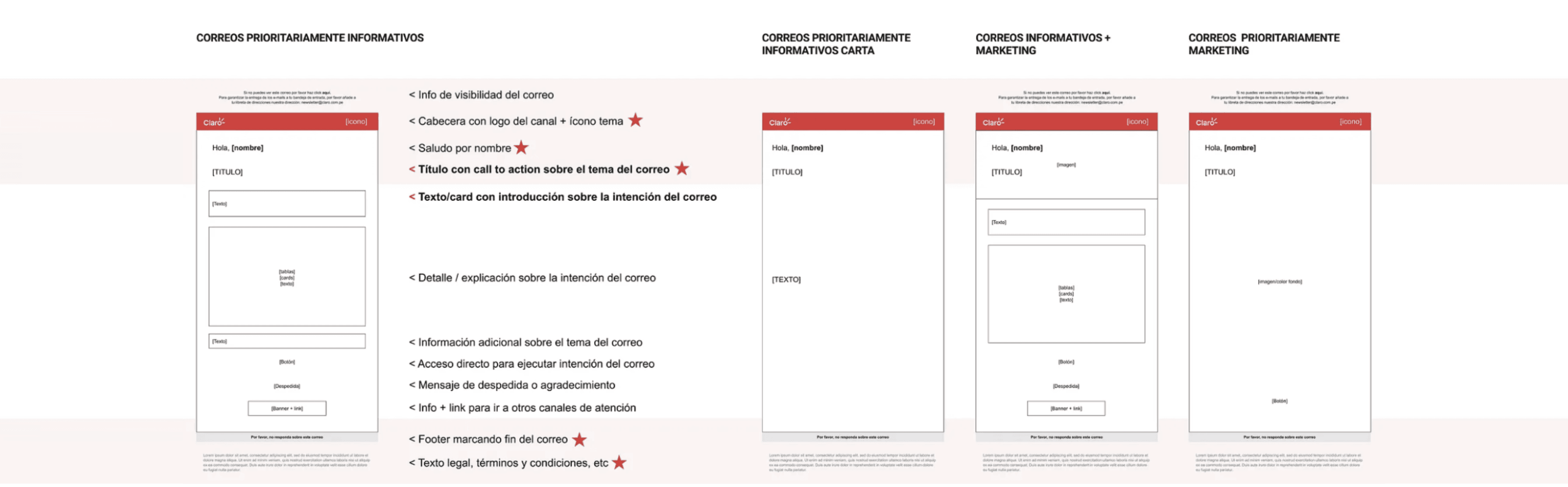
Information Architecture
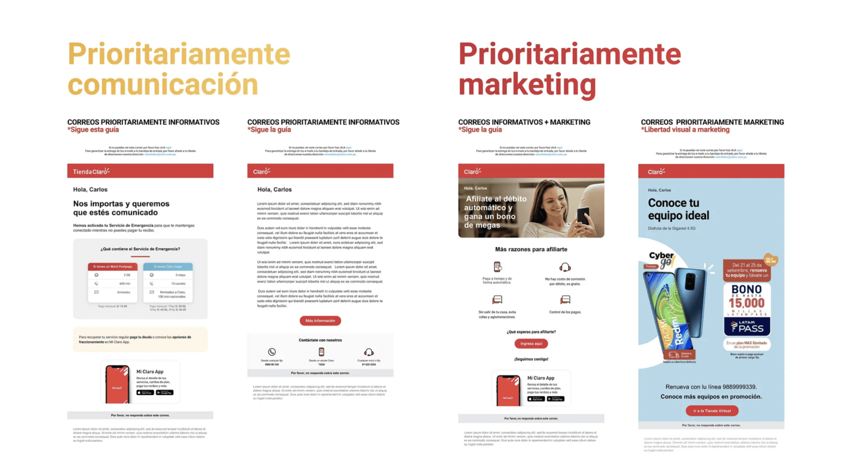
Main email differentiation
Claro Brasil inspired us on opting for the online dissemination of the guides, also for the use of slack for team communication
The project was initially conceived with an email scope. It’s success inspired pivoting to an expansion and implementation of a Design System.
The expansion with new molecules and UX writing helped not only the approval of emails but also other digital channels.

Initial library
RESULTS & IMPACT
The same file circulated through different areas, generating fewer iterations and faster approvals. Different agencies working for Claro also had now an unique source of information, finally achieving consistency.

E-mails library and storybook


